Fabulous-Confection6@Fabulous-Confection6

A Reddit showcase of prismantis 0.10.0, a free MIT Claude Code plugin that restyles the terminal so tool calls are dimmed and right-aligned while Claude's messages stay left, similar to a chat app. It also adds prompt bubbles, configurable toolStyle and promptStyle presets through /config, and preserves the classic look. The post links the GitHub repository with screenshots of each style and provides marketplace install commands.
The author describes scrolling long Claude Code sessions where tool calls and Claude's replies looked identical, then building prismantis so tool calls move to the right, dimmed, capped at 60% width, while Claude's sentences stay on the left. The mod was developed with Claude Code, which wrote render code and tests and ran real Haiku sessions for screenshots. Also included: prompt bubbles, bar and chevron options, and four variants per feature selected in /config (toolStyle: chat, tree-dim, tree-bold, classic; promptStyle: bubble, bar, chevron, off). Existing features include themed markdown, tables, mermaid diagrams and bar charts, copy buttons, and Hebrew/Arabic RTL support. Installation: /plugin marketplace add NahumLitvin/prismantis and /plugin install prismantis@prismantis. Repo: https://github.com/NahumLitvin/prismantis
설치 방법은 원본 출처를 확인하세요.
Last week I was scrolling a long Claude Code session and couldn't tell what Claude said from what it ran. Every line starts with the same dot. "Read 1 file", "Now I'll read the roster", "Read 1 file", same color, same column. A wall of dots. So in prismantis 0.10.0 tool calls move to the right, dimmed, and Claude's sentences stay on the left. It reads like WhatsApp: Claude talks on one side, the tools answer on the other. Rows are capped at 60% of the width so a long path doesn't eat the screen. I built prismantis with Claude Code. I described the look I wanted, Claude Code wrote the render code and the tests, then ran real Haiku sessions in Terminal.app and screenshotted each style so I could pick. Every style in the README is one of those screenshots. It also caught its own mistakes, like bold plus dim rendering bright in most terminals, which is why the dim styles drop bold. The GIF is those real sessions, before and after, same prompt. Also new: your own prompts get a bubble, so scrolling back you find what you asked in a second. Bar and chevron if a box is too much. I couldn't pick one look, so each feature has 4 and you choose in /config. toolStyle is chat (default), tree-dim, tree-bold or classic. promptStyle is bubble (default), bar, chevron or off. classic and off give you the old look back exactly. prismantis is free and MIT. It already did themed markdown, tables, mermaid diagrams and bar charts in the terminal, copy buttons and Hebrew/Arabic right to left. To try it: /plugin marketplace add NahumLitvin/prismantis /plugin install prismantis@prismantis Repo with screenshots of every style: https://github.com/NahumLitvin/prismantis Which style did you end up on? I went back and forth between chat and tree-dim for a whole morning. submitted by /u/Fabulous-Confection6 [link] [comments]

Claude Code용 Firstmate Calm입니다. 범선 작업 애니메이션과 대화만 보여 주는 트랜스크립트 표시를 제공하며 Pi Calm 확장과 home별 config/calm 설정을 공유합니다. hooks 모듈은 CLAUDE_CODE_ENABLE_FUNCTION_HOOKS 또는 Claude Code의 tengu_plugin_hooks_modules rollout flag를 통해 로드될 수 있지만, CLAUDE_CODE_ENABLE_FUNCTION_HOOKS가 정확히 1일 때만 mod가 활성화되고 그 밖에는 완전한 no-op입니다.

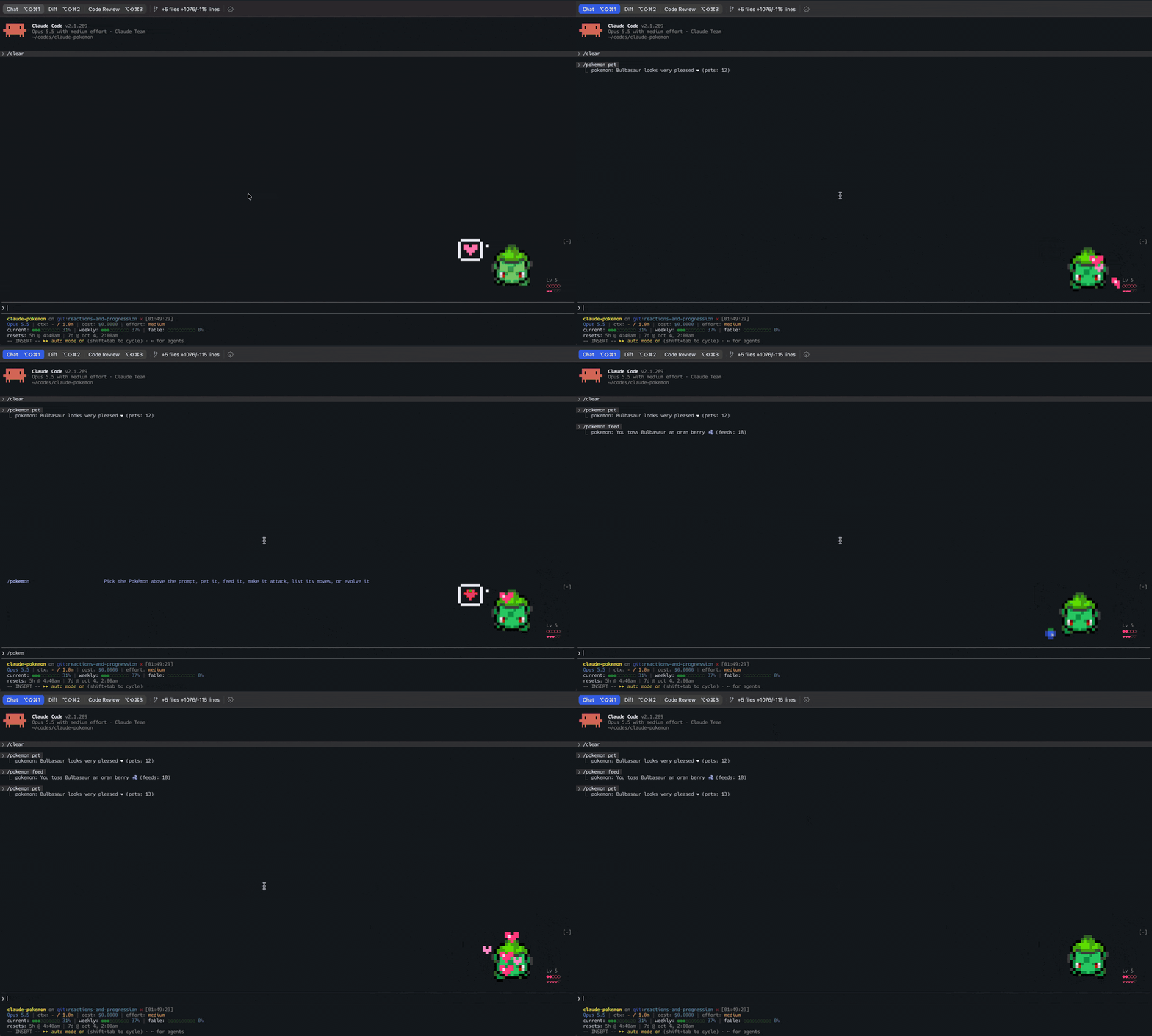
Claude Code 프롬프트 위에 사는 픽셀 포켓몬입니다. Claude가 하는 모든 것에 반응합니다.

Claude Code 출력 스타일(Epistemic Ink)과 그 스타일이 작성한 ```mermaid 및 ```math fence를 터미널 도형으로 그리는 mod를 결합합니다. transcript 텍스트로 이미 그릴 수 있는 내용은 텍스트로 남깁니다.